Options

Sisters

Reflections By BrianReflections By Brian Registered Users Posts: 57 Big grins
edited September 10, 2014 in People
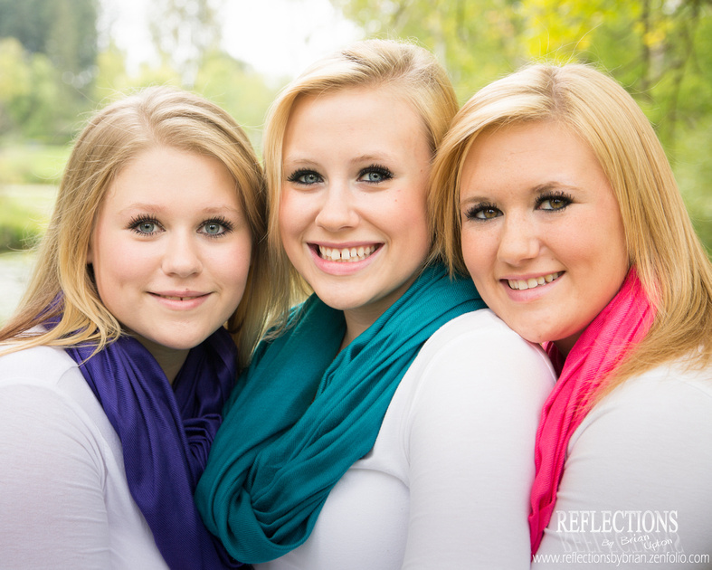
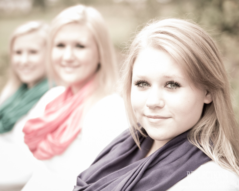
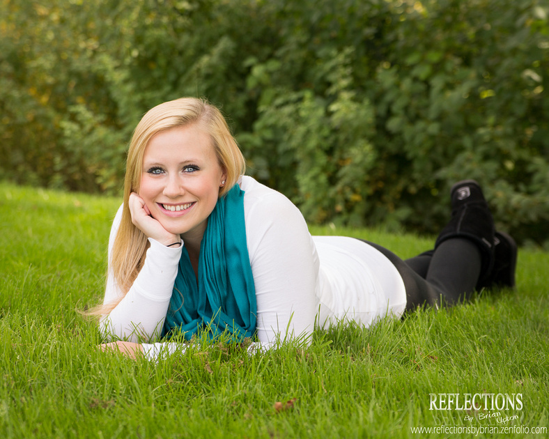
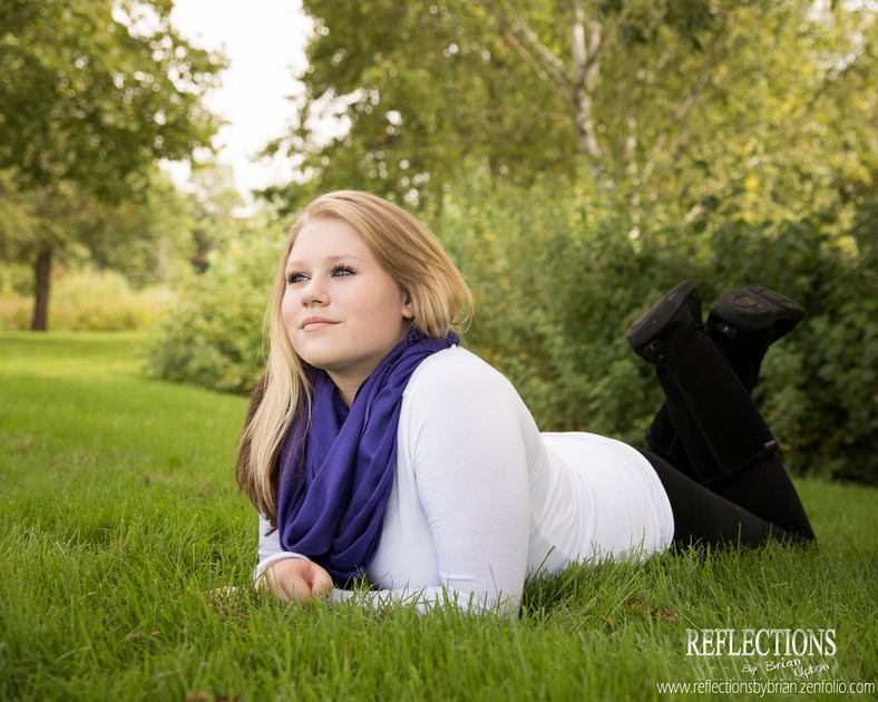
This is a shoot I did with three sisters. I haven't done to many portrait shoots yet with multiple subjects, but I am hoping to get more once fall gets here. I found it tricky to balance the light and colors with the different skin tones of each of the girls. Two of them had extremely pale skin while the other had fairly dark skin, in comparison. How do you all deal with that?

1)
p533488255-4.jpg

2)
p219295979-4.jpg
3)
p353756352-4.jpg
4)
p304883249-4.jpg

5)
p142440522-4.jpg

Comments

  • Options
    DisneyNutDisneyNut Registered Users Posts: 7 Beginner grinner
    edited September 8, 2014
    I'm not a portrait photographer either but here is my take on your shots.
    #1. That hot spot at the top is distracting. Maybe some skin smoothing is in order.
    #2. Looks good. Maybe just a tad too hot.
    #3. The black bracelet on her wrist is somewhat distracting. Clone it out.
    #4. Again that bright spot just abover her head is distracting.
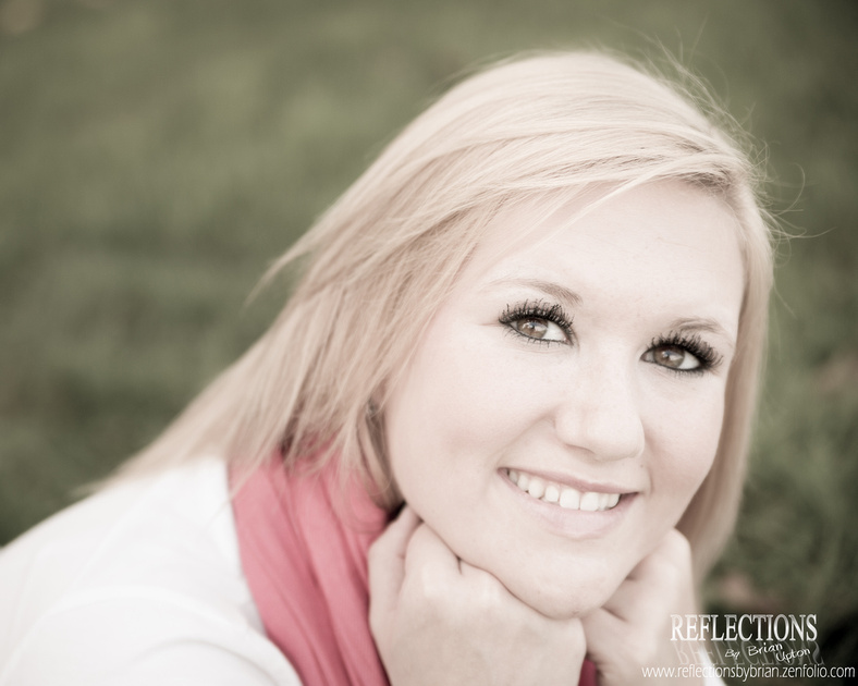
    #5. Too much goop on her eye lashes. And her eyes are not the focus point...there is no focus point. The entire shot is soft.
  • Options
    HackboneHackbone Registered Users Posts: 4,027 Major grins
    edited September 8, 2014
    I really like the first and last ones and the in between ones are OK but not my cup of tea. On the first one the bright area behind is very distracting, a darker background would have really made them jump out but I do like the use of the sky/sun to back light the hair. The posing and expressions are great on the first one and I think you can get the colors to pop more by raising the black point a tad.

    I like the processing on the last one but I might add a slight vignette to it. Whenever the hands are close to the face have them pretend that they are resting their head on their hands as when they do it naturally it smoousches (sp) the face a bit and try to never show the back of the hand as that fattens up the hand, just not feminine.

    Overall nice job on these.
  • Options
    Dooginfif20Dooginfif20 Registered Users Posts: 845 Major grins
    edited September 9, 2014
    I think the poses and the shots themselves look good. My only nit for almost the whole set is your exposure and WB are off. The first one is quite a bit over and the bright spot (Charles and Disney already mentioned it) makes it hard to see the difference between the background and their hair. Just my opinion but most of these would look lightyears better if you add a multiply layer and mask it off of them and just dial down the opacity for the background. I also agree with all other comments provided.
  • Options
    divamumdivamum Registered Users Posts: 9,021 Major grins
    edited September 9, 2014
    Not a fan of the desat processing in the 2/5.

    #1 is for sure the winner here. As others have mentioned. selectively darken (and maybe dessaturate) the green and bright background and that one's great. Excellent posing.
  • Options
    D3SshooterD3Sshooter Registered Users Posts: 1,187 Major grins
    edited September 9, 2014
    I tend to go along with divamum….. of course the desaturation is a matter of taste…
    A photographer without a style, is like a pub without beer
  • Options
    Reflections By BrianReflections By Brian Registered Users Posts: 57 Big grins
    edited September 10, 2014
    Thanks for all the critiques. Its funny how I didn't notice several of the things mentioned when I took and edited the photos. The bracelet is driving me nuts now that it has been mentioned. I am really working on having that "photographer's eye" when taking the shot instead of having to remove things like that in post. I totally agree with resting the face on the hands and squishing the face, but I hadn't even considered the direction the hands were facing.
  • Options
    kdotaylorkdotaylor Registered Users Posts: 1,274 Major grins
    edited September 10, 2014
    #2 and #5 look way too bright. I'm sure you did that for a reason, but personally I don't think it's flattering. Also, wow, those eyelashes--that's the fault of their make-up and not you! Love the rest--you can see the connection among them, and the lighting/crops, etc all work.
    Kate
    www.katetaylor.smugmug.com
    "You cannot depend on your eyes when your imagination is out of focus." Mark Twain
Sign In or Register to comment.