Options
SM Layout: Properly Center Image Pagination
 leftquark
Registered Users, Retired Mod Posts: 3,784 Many Grins
leftquark
Registered Users, Retired Mod Posts: 3,784 Many Grins
If you're like me and you've added text next to the "Download", "Info", "Tools", and other icons below a photo then you may have noticed that the image pagination (photo "< 1 / 19 >", for example) is no longer centered. It really bothered me that it was pushed to the left too much.
SmugMug used an improper method to center the text: they used "text-align: center". This centers the text within the child division (there are 3 division: the share button (called 'action'), the image-pagination, and the tools buttons). The text appears center within the image-pagination division but what we really want is it to be centered within its parent division. Here's how it should have been coded.
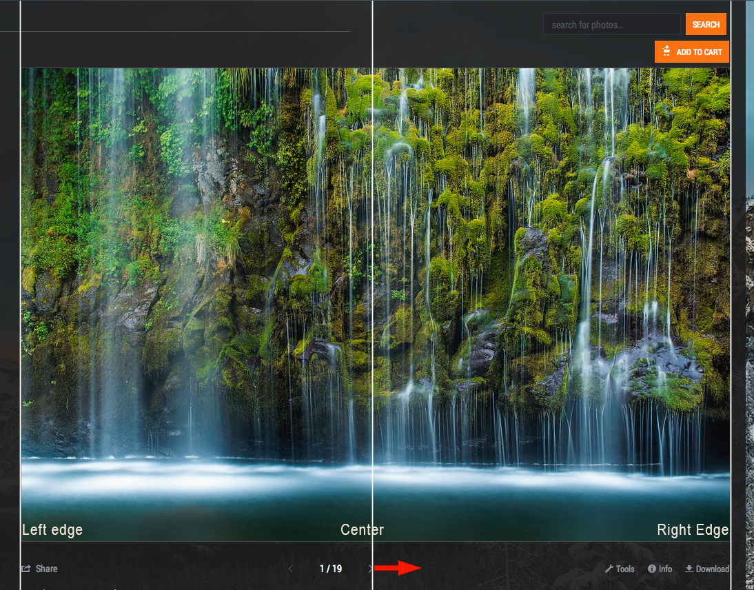
See example below, prior to using the below code:
Adding the following code will properly align your image-pagination section:
Perhaps SM can fix this themselves and not require users to enter the above CSS to fix it?
SmugMug used an improper method to center the text: they used "text-align: center". This centers the text within the child division (there are 3 division: the share button (called 'action'), the image-pagination, and the tools buttons). The text appears center within the image-pagination division but what we really want is it to be centered within its parent division. Here's how it should have been coded.
See example below, prior to using the below code:
Adding the following code will properly align your image-pagination section:
/* Properly center the image pagination */
.sm-user-ui .sm-gallery-smugmug .sm-gallery-image-pagination {
  margin-left: auto;
  margin-right: auto;
  width: 40%;
}
Perhaps SM can fix this themselves and not require users to enter the above CSS to fix it?
dGrin Afficionado
Former SmugMug Product Team
aaron AT aaronmphotography DOT com
Website: http://www.aaronmphotography.com
My SmugMug CSS Customizations website: http://www.aaronmphotography.com/Customizations
Former SmugMug Product Team
aaron AT aaronmphotography DOT com
Website: http://www.aaronmphotography.com
My SmugMug CSS Customizations website: http://www.aaronmphotography.com/Customizations
0
Comments
Cheers,
I guess the bug report at http://dgrin.com/showthread.php?t=239428 can be considered to be dealt with now?
- I played with the value for the width - I found using 30% better at full-screen at my screen res (1280 x 800) and with the text that I've added next to the "Like" and "Info" icons. YMMV.
- It does odd things if the window-width is reduced (but then again so does the rest of the content of that block), this could be an issue for small-screen devices.
It's still very much better than the "looked-like-centred-but-wasn't" original and it's a great workaround until SM sort it out properlyHmm... yes... now that you mention it I did play around with using different %'s for the width. In some cases changing between 50% and 30% did nothing. At some point if the screen gets small enough the 30% ends up causing the pagination to overflow onto a new line. Increasing to 40% keeps it on 1 line. If I continue to shrink the screen then the layout changes to a small-screen mode (something I setup using the screen width code) and everything fits again. I decided to split the difference and update my code to width: 40%.
Also, one way to help mitigate some of the space issues on small screens is to only show the additional icon text if the window is big enough. I do the following:
/* For large screens only */ @media only screen and (min-width: 1200px) { /* Add the word "Download" after the download button */ .sm-button.sm-button-image-download:after { content: " Download" !important; } /* Add the word "Info" after the info button */ .sm-button.sm-button-image-info:after { content: " Info" !important; } /* Add the word "Tools" after the tools button */ .sm-button.sm-button-image-edit:after { content: " Tools" !important; } /* Add the word "Like" after the like button */ .sm-button.sm-button-image-like:after { content: " Like" !important; } /* Lightbox Add the word "Comment" after the Comments button */ .sm-lightbox-icons .sm-button.sm-button-image-comment:after { content: " Comment" !important; } /* Lightbox Add the word "Share" after the Share button */ .sm-lightbox-icons .sm-button.sm-button-image-share:after { content: " Share" !important; } /* Lightbox Add the word "Sizes" after the Sizes button */ .sm-lightbox-icons .sm-button.sm-button-image-sizes:after { content: " Sizes" !important; } }Former SmugMug Product Team
aaron AT aaronmphotography DOT com
Website: http://www.aaronmphotography.com
My SmugMug CSS Customizations website: http://www.aaronmphotography.com/Customizations
Many thanks for that... i just added a MapThis text but i really like that piece of code
Here's something else that I've applied that "tightens things up" a bit:
.sm-user-ui .sm-gallery-smugmug
.sm-button.sm-button-size-small.sm-button-skin-default.sm-button-nochrome
{padding-left:0px;padding-right:0px;}
I also faffed with.sm-user-ui .sm-gallery-smugmug .sm-gallery-image-totals {margin-left: -1em;margin-right: -1em;}and although the central part contracts nicely, the left-arrow became unresponsive. Maybe someone could improve that bit?The following seems to work for reducing the width of the central part:
.sm-user-ui .sm-gallery-smugmug .sm-gallery-image-totals
{display: inline;}