Options
Padding / Margin (white border) on Mobile view?
 Newah
Registered Users Posts: 5 Beginner grinner
Newah
Registered Users Posts: 5 Beginner grinner
Every time that I resize the browser down to trigger to mobile size, I get a white border around the entire browser / screen on mobile. WHY? I'm trying to use a fullscreen background image for a part of the site and in mobile it's stuck with these white borders! I inspected it and it seems to be coming from
@media screen and (max-width:670px) {
.sm-page-widget .sm-page-widget-content{
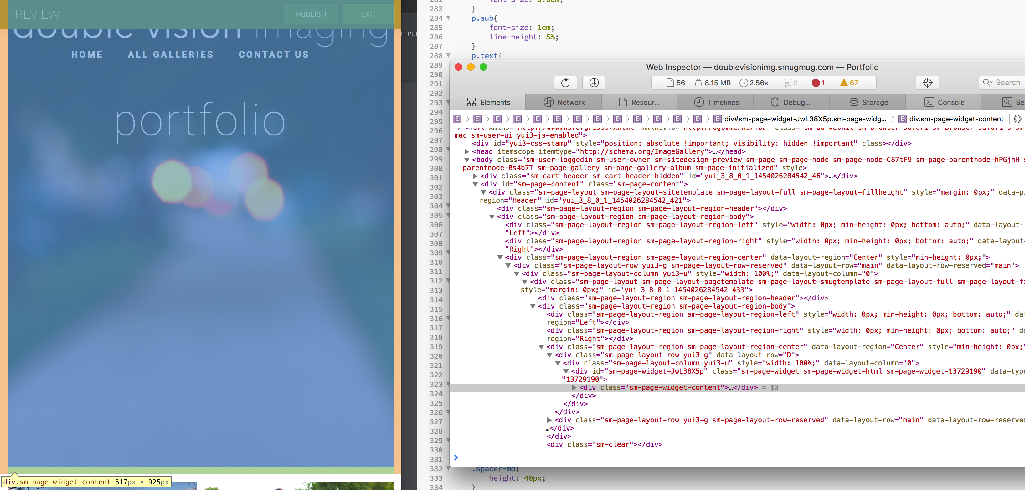
As you can see, it's highlighted in orange / green on bottom when inspected. This is so frustrating.
I can't figure out how to get rid of this. I've tried adding custom CSS rules to override it and change it back to 0, but I haven't had any luck.
@media screen and (max-width:670px) {
.sm-page-widget .sm-page-widget-content{
As you can see, it's highlighted in orange / green on bottom when inspected. This is so frustrating.
I can't figure out how to get rid of this. I've tried adding custom CSS rules to override it and change it back to 0, but I haven't had any luck.
0
Comments
/*Remove side margins and vertical padding*/
.sm-page-widget-INSERT_WIDGET_ID .sm-page-widget-content {
margin-left:0px !important;
margin-right:0px !important;
padding-top:0px !important;
padding-bottom:0px !important;
}
}
... good luck
tailoredportraits.com
Hey! That worked! I guess I didn't think about adding a widget id.
Thank you!