Well – by no means am I the expert but it helps me to study the photo and find out what is right and what is wrong. Will learn from other comments too!
I think the idea is here; patterns and lines.
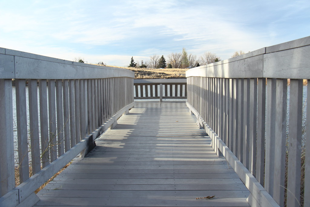
On the first one I see a bit of tilt, not as even with horizon.
Check the white balance and shadows, a bit more contrast.
Maybe cropping it to bring it more toward the face?
Bring out the clouds a bit more.
Make the wood a bit more ‘gritty’ or grainy or just a bit of 'punch'?
Convert to b/w
Same with second. You could have fun with these!
#1 - Looking at the horizontal section of the dock it looks like your horizon is correct but since you were not centered in the walkway (see top railing left and right) and the hills sloping in the back- the image has a x-cross tilt feel to it.
The colors and contrast are pretty bland so there is not much that grabs your attention. If you look at abstract and architectural photography contrast is huge aspect. Landscapes it is about motion or sweet light - you dont have any of these factors going on. Try converting to bw and playing with contrast.
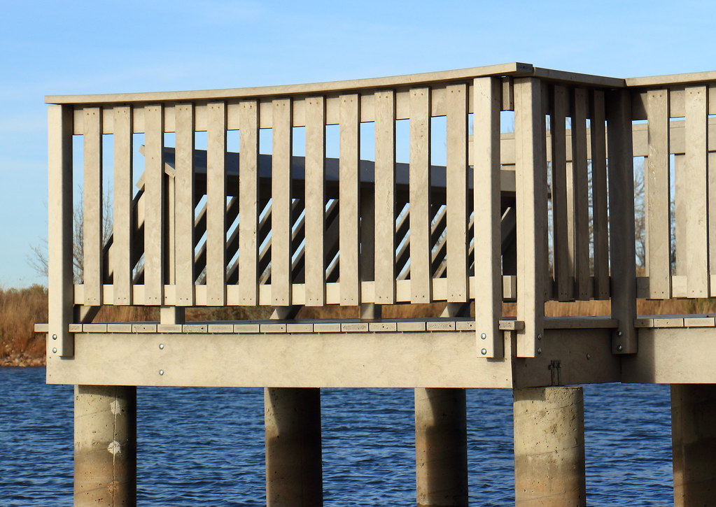
#2 - If you are trying to sell the fake wood decking this might be a usable photo but otherwise not so much. It is very centered (left to right and top to bottom) and lacking any real interesting feature.
"The Journey of life is as much in oneself as the roads one travels"
#1 - Looking at the horizontal section of the dock it looks like your horizon is correct but since you were not centered in the walkway (see top railing left and right) and the hills sloping in the back- the image has a x-cross tilt feel to it.
The colors and contrast are pretty bland so there is not much that grabs your attention. If you look at abstract and architectural photography contrast is huge aspect. Landscapes it is about motion or sweet light - you dont have any of these factors going on. Try converting to bw and playing with contrast.
#2 - If you are trying to sell the fake wood decking this might be a usable photo but otherwise not so much. It is very centered (left to right and top to bottom) and lacking any real interesting feature.
i do agree with you -- the only thing interesting at this spot is the deck
I think the first picture is the exercise (which way is the broken piece leaning? Is it just shorter at the end? What's going on? Although if it were leaning out, it should be lit...)
 catcher33
Registered Users Posts: 81 Big grins
catcher33
Registered Users Posts: 81 Big grins
Comments
grt,boco.
I think the idea is here; patterns and lines.
On the first one I see a bit of tilt, not as even with horizon.
Check the white balance and shadows, a bit more contrast.
Maybe cropping it to bring it more toward the face?
Bring out the clouds a bit more.
Make the wood a bit more ‘gritty’ or grainy or just a bit of 'punch'?
Convert to b/w
Same with second.
You could have fun with these!
The colors and contrast are pretty bland so there is not much that grabs your attention. If you look at abstract and architectural photography contrast is huge aspect. Landscapes it is about motion or sweet light - you dont have any of these factors going on. Try converting to bw and playing with contrast.
#2 - If you are trying to sell the fake wood decking this might be a usable photo but otherwise not so much. It is very centered (left to right and top to bottom) and lacking any real interesting feature.
Aaron Newman
Website:www.CapturingLightandEmotion.com
Facebook: Capturing Light and Emotion
i do agree with you -- the only thing interesting at this spot is the deck
The second picture is the explaination.
I might be WAY off though.
Hi! I'm Wally: website | blog | facebook | IG | scotchNsniff
Nikon addict. D610, Tok 11-16, Sig 24-35, Nik 24-70/70-200vr