Options
Engagement Snaps
Friends of the Mrs. are getting married at the end of July. After politely declining the request to photograph their wedding, (told them that having me photograph their wedding would be like going to a podiatrist to look at a sore throat) I offered to do a short engagement session for them so I didn't come off as a total schmuck.
Had them meet me at the park just after I finished an early morning senior session.
Eh...
So, so.
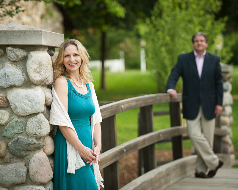
1.
 [/url]
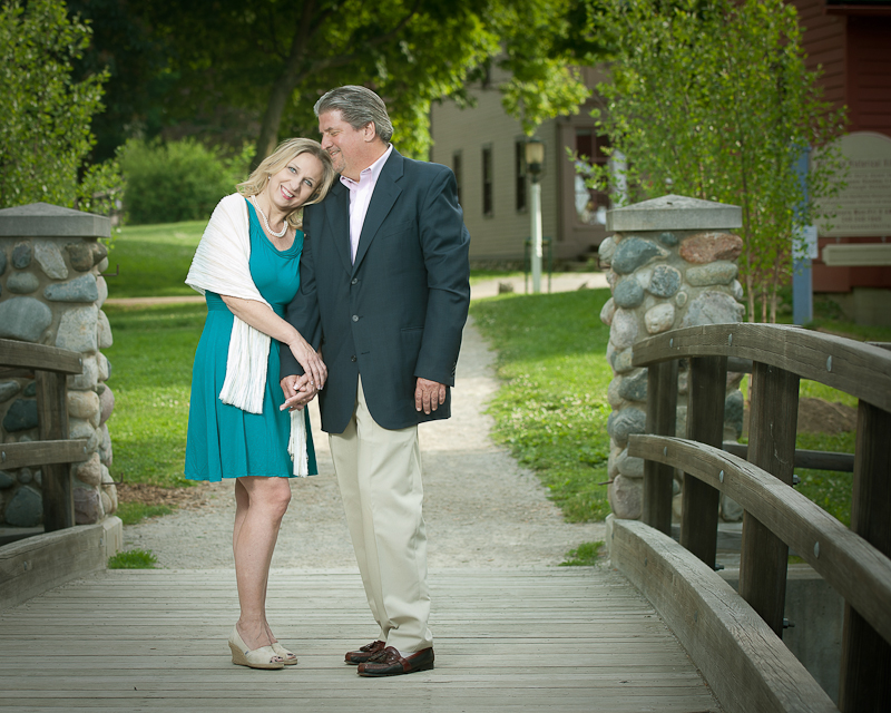
2.
 [/url]
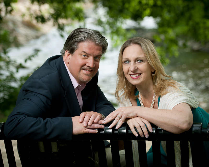
3.
 [/url]
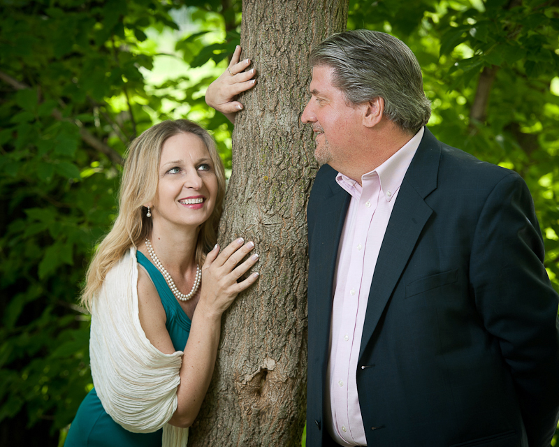
4.
 [/url]
5.
 [/url]
6.
 [/url]
Had them meet me at the park just after I finished an early morning senior session.
Eh...
So, so.
1.
[/url]2.
[/url]3.
[/url]4.
[/url]5.
[/url]6.
[/url] 0
Comments
#2 is ok
#3 wow, really nice portrait
#4 is another great execution of a cliche', except for the mystery-hand over her head. Whose is it, his or hers?
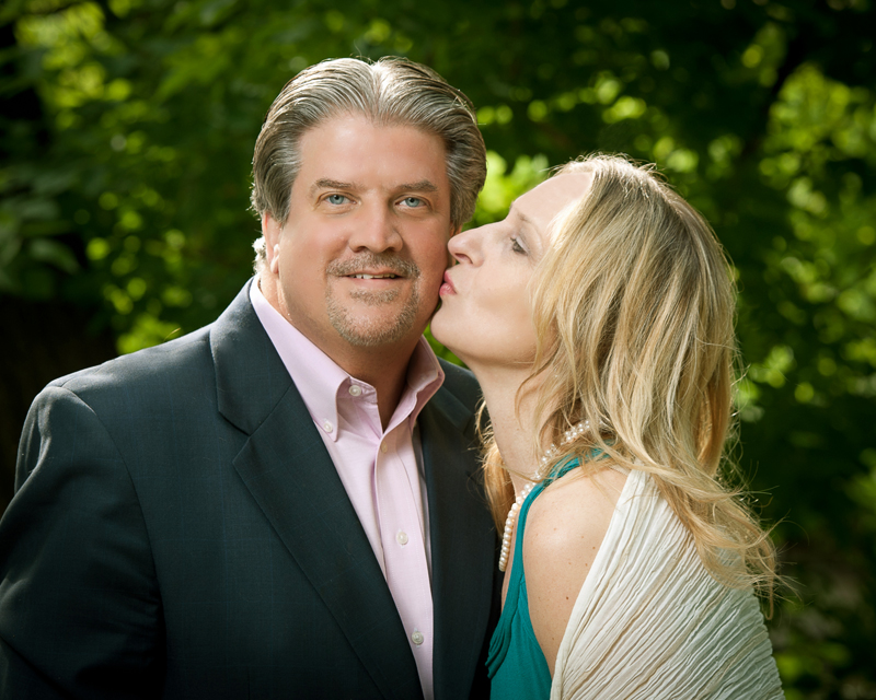
#5 kiss doesn't look real and that angle doesn't flatter her, IMO.
#6 is gorgeous. I'm loving that bright foliage behind their heads. Pose is perfect except for shooting the back of her hand which isn't ideal but probably unavoidable here.
Nice job overall!
Link to my Smugmug site
Link to my Smugmug site
#5 is tosser though.
#4 is technically great but posing/interaction is not doing it for me..it is too "youthful" is the best way I can describe it.
14-24 24-70 70-200mm (vr2)
85 and 50 1.4
45 PC and sb910 x2
http://www.danielkimphotography.com
Hey, how do you know they aren't big fans of the Adam's Family?:D
Thanks for taking the time to comment. It be helpful!
And yup, shoot through umbrella and a second bare speedlight in some.
I agree!
Thanks Qarik.
www.cameraone.biz
I think you did a great job, and would rock a wedding!
www.katetaylor.smugmug.com
"You cannot depend on your eyes when your imagination is out of focus." Mark Twain
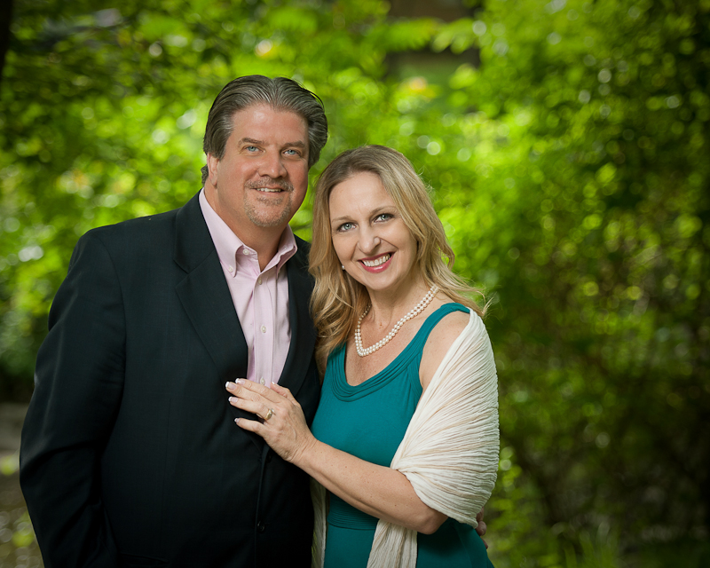
They just ordered a 20X24 Gallery Wrap of number 1.
I'm happy, they're happy!
I hate when clients choose the wrong image. 1 is all about her, not them as a couple. 6 is the one they should have gone with, it's really great in every way.
Yeah yeah, they're "right" about what they think they like, but they're wrong about the photography.
Anyway, I hope you delete the bra line before printing.
An "accurate" reproduction of a scene and a good photograph are often two different things.
I didn't know there was a right or wrong photograph
An "accurate" reproduction of a scene and a good photograph are often two different things.