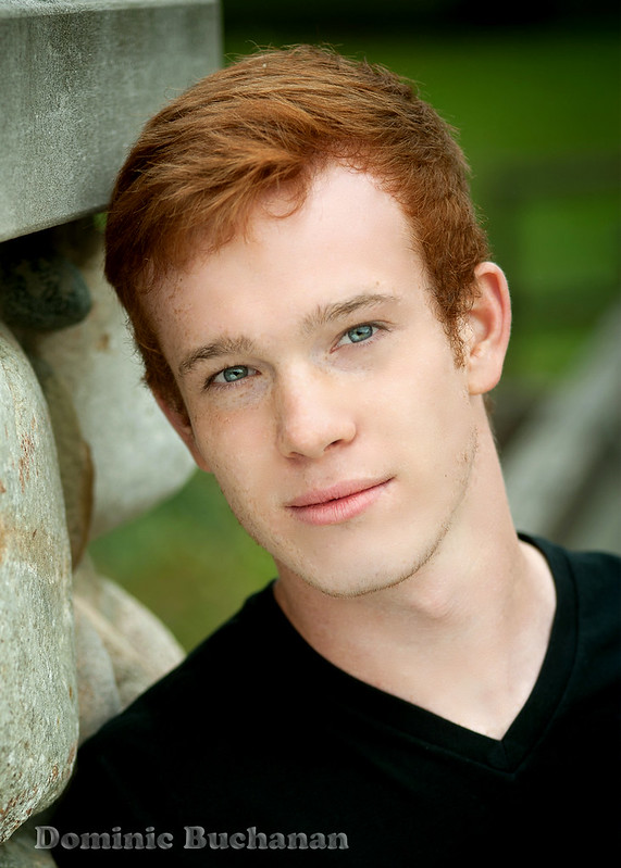
Hmmm tastes are different, so that is not a point to discuss. Not knowing for what purpose this is made makes it a bit more hard to asses. Models come in all kind of forms and roles. What is his intention as a model ?
Pictures seem to be OK, although I am not to keen on the color palette
, the green just doesn't cutt it for me.
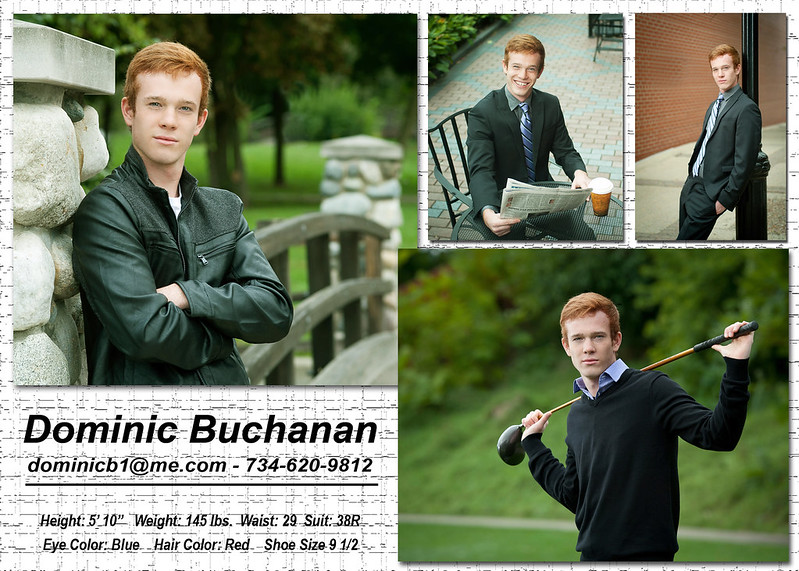
Layout and graphical approach; Here things go really wrong for me , I don't see a distinct style, a mood , something that would make people look at the model. Instead I see collage of pictures that are forced onto a sheet...same expression... to many .... to busy......
A card needs to pull the attention... with one or two eye-catchers.... and as the saying goes More is less and Less is More.
The background......keep it simple, now it pulls the attention away from the pictures , this kind of wanna be texture does not work and comes over cheap and amateuristic . Why not leaving it without a structure and select a nice photo paper for the prints....
I am not trying to be negative, I just state what I think and how it can be improved. Well that is at least what I think and means nothing......it is just my opinion....
A photographer without a style, is like a pub without beer
100% disagree with the majority of what ^^^^ said. I love the color palette and I love the greens! My only nits are do you have any other shots in any other outfits? For me it looks like all the images were shot by the same person and during the same shoot. I would think it would benefit him to show he has the ability to work with multiple photographers. Also I would either recrop the bottom left image or use something different so that it all lines up. I would also just make the background a solid color.
I'm a no nonsense person so the texture does not bother me. I tend to get to the meat of it so I head for the stats and ignore the "prettiness" of the card. My biggest nit is the mono chromatic color of the clothing so nothing in particular grabs me eye. He has different clothing styles but needs to add some impact by adding color then my eye would be forced to focus on particular details. The bottom image overlapping does bother me some. In all the photography is great in all aspects but the card needs to have more zap to get a second look, as it stands if I were a model agent I might just give it a cursory glance then toss it.
Is this for modeling or acting. Reason I ask is that for modeling, the uniformity (or very close) of expressions might be OK. For acting, he'd need to show more range of personality and emotional pull. I do shoot comp cards for models and actors/comedians and they are very different shoots.
Bilsen (the artist formerly known as John Galt NY) Canon 600D; Canon 1D Mk2; 24-105 f4L IS; 70-200 f4L IS; 50mm 1.4; 28-75 f2.8; 55-250 IS; 580EX & (2) 430EX Flash,
Model Galleries: http://bilsen.zenfolio.com/
Everything Else: www.pbase.com/bilsen
hahaha, it seems that we all have a different opinion on this..... Must be taste related.... good that we all have a different taste..otherwise life would be oooo so boring...
A photographer without a style, is like a pub without beer
Hackbone, you have a point .But where I life is the overall impression and representation of a model card very important . Its like a CV, you don't write it on the back of a napkin ? do you. No matter how good the content is..... This is more about graphical layout then photography and that was the part I was commenting on.
Greetings , Steve
A photographer without a style, is like a pub without beer
Comments
Pictures seem to be OK, although I am not to keen on the color palette
, the green just doesn't cutt it for me.
Layout and graphical approach; Here things go really wrong for me , I don't see a distinct style, a mood , something that would make people look at the model. Instead I see collage of pictures that are forced onto a sheet...same expression... to many .... to busy......
A card needs to pull the attention... with one or two eye-catchers.... and as the saying goes More is less and Less is More.
The background......keep it simple, now it pulls the attention away from the pictures , this kind of wanna be texture does not work and comes over cheap and amateuristic . Why not leaving it without a structure and select a nice photo paper for the prints....
I am not trying to be negative, I just state what I think and how it can be improved. Well that is at least what I think and means nothing......it is just my opinion....
www.cameraone.biz
Is this for modeling or acting. Reason I ask is that for modeling, the uniformity (or very close) of expressions might be OK. For acting, he'd need to show more range of personality and emotional pull. I do shoot comp cards for models and actors/comedians and they are very different shoots.
Canon 600D; Canon 1D Mk2;
24-105 f4L IS; 70-200 f4L IS; 50mm 1.4; 28-75 f2.8; 55-250 IS; 580EX & (2) 430EX Flash,
Model Galleries: http://bilsen.zenfolio.com/
Everything Else: www.pbase.com/bilsen
Greetings , Steve